
5 Ideas for a great mobile website design!
Mobile websites can be tricky to design due to the limited space of a mobile screen. However that can never be an issue for creating a great looking mobile site!
One of the most common mistakes people do is trying to insert all the information and design elements from the desktop version to the mobile version! Hence, we’ll go through each mistake and explain who you can transform and translate it into mobile so stick with us!
1. Re-create, don’t resize!
We continue with the most common mistake we mentioned above. In our previous article we advised you to never try compressing a desktop website into a mobile one. The best alternative is to create a dedicated mobile site. You can read more about this here! However, now, we will focus more on how you can do this, not necessarily why.
It is important for you to keep the two versions related. Meaning, if you have a material design desktop version, keep a material design mobile version. Don’t combine the styles and most of all do not combine the colours. Scroll down for more tips about colours. It is important for you to have an online identity. People must recognise you and link you to certain online elements you provide.
Don’t just resize your desktop elements to a smaller size so it fits the mobile screen size. Recreate them for a dedicated site!
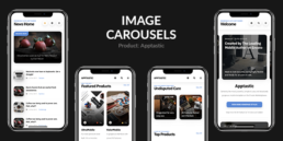
Here you have a specific example. Let’s say for desktop you have at the top of your homepage a horizontal layer of different pictures that display some of your best products in the store. You cannot resize it because the pictures will be two small and it will look awful on mobile! Consequently, there are two versions you can turn this element into:
- You can get rid of it completely and substitute this visual element with a nice heading text.
- You can use a carousel! Display all your images and products with a good looking top slider and don’t compromise the user experience!
Therefore, tip one:
- always recreate, never resize!
- use the same colour palette as in desktop version.
- cut out the unnecessary elements for mobile
- Transform the desktop elements into mobile elements
2. Interactive Elements
Interaction with users can be vital for your mobile website. Make sure you include elements that have great animations, but not too many, it will affect other elements such as loading speed.
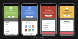
However, there are some elements that can help you create a better ux. Try using share buttons that brings users to your social media accounts, make a walk through sheets where you introduce the users to your business or have a little tutorial on how to use your website.
All these will help you connect and keep contact with your website visitors. These are not specific for mobile, you can find all these elements in a desktop version too. But they are of higher importance on mobile. Why? Well, keep in mind that your mobile site is probably the first version that will be visited by your users. It has to be catchy, eye candy and interactive so you can convert these users into buyers or subscribers and visitors to your desktop version!
Tip 2:
- create interactive elements such as cookie sheet, share buttons, accordions, video sheet etc.
3. Space
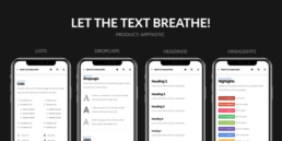
Let your text breathe! Remember, we said at the beginning that it is never good to insert every piece of information to your mobile version. Terefore, make sure you display the ones that have the greatest data value that can attract customers / user to your main website.
It is normal for your mobile website to be crowded and boring if you insert 1000000 words sized text on your landing page. It is not wikipedia!
Moreover, after you selected the most important data for your mobile, do not over crowd them either! Make sure you use the right padding and margin value for each element/box of content. People can scroll down so don’t put everything at the beginning!
Tip 3:
- Use a text size of min 12 px
- Make Use of lists
- Use highlights
- Headings are a must! (Make sure you put the headings in a hierarchic manner. For example at the beginning you have Heading1 sized and you go down to Heading 5 sized text. You will have a hierarchy like this: H1, H1, H1, H2, H3, H4, H5 ). It will help your SEO big time!
- Use contrasts
- If the contexts requires and is adequate, use drop-caps
4. Useful Mobile Elements
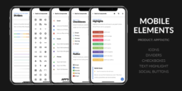
There are certain elements that are special crafted for mobile and we strongly advise you in using them.
Therefore, make sure you use: toggles, search bar, tabs, toasts, icons, dividers, notification boxes, pricing tables, sliders for images, snack bars.
You can see more of them here.
Tip 4:
- Use mobile specific elements
- Give life to your mobile website
- Don’t overcrowd it with them
- Be moderate in every aspect
5. Color Palettes
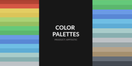
This is a sensitive aspect so pay attention. If you are NOT a designer you should use colour palettes that are already chosen by specialists. Trust us, there is a very thin line between a bad red and a Ferrari red.
There are people that are specialised in choosing colours, who can see amazingly great and unexpected combinations that can work for your website. We know that we would all want to use our favourite blue, but our favourite blue might nit work at all with the Ferrari red.
Link your mobile website with your desktop version through your online identity. Don’t change colours or styles because you will confuse your users.
Tip 5:
- Choose a colour palette and go with it until the end!
- Don’t insert your favourite blue with Ferrari red!
- Choose a specialised opinion, there are plenty online.
- Connect it with your desktop version (use the same palette)
However, this can be complicated for a non-tech user. Building a website from scratch can be demanding and really point-less. You can search our portfolio and choose the perfect template for you. No matter if you want a HTML Template, AMP, PhoneGap & Cordova or WordPress, we have them all. They are all well documented and ready to be used and customised! Check our portfolio here!
That’s all, if you have more things that you think it should be included here make sure you share them with us in the comment section!
Bonus! Here you have an article with some amazing online free resources you can use for your next project! Click this link! And here is a quick shoutout to one of our partners! Sell Free Now is a website where you can find a tone of useful things, and moreover you can share your services is you are a freelancer. Make sure you follow sellfreenow.com !