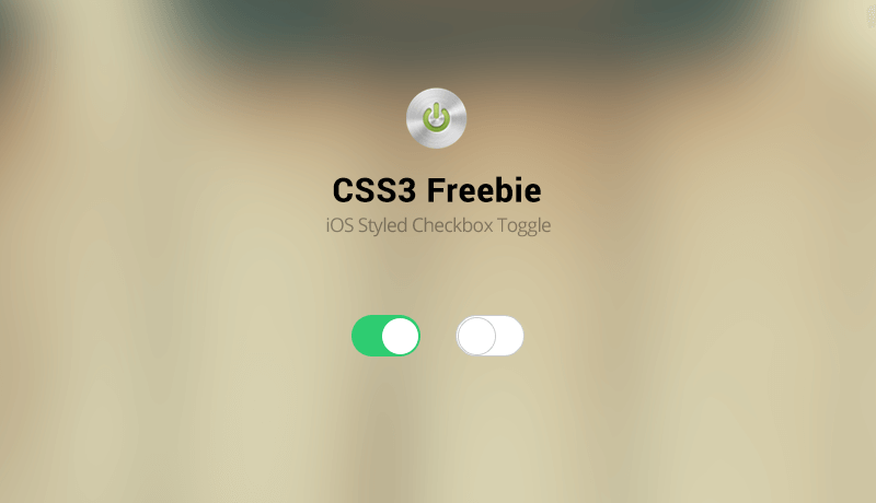 Another beautiful feature feature any mobile website should have are OS Styled Checkboxes. In this case, we’re giving out a free example of the ones used in iOS, and with a bit of tinkering around you can adapt them to your needs. The beauty of it? It’s pure CSS3 and HTML, so there’s no plugin, it’s just a copy and paste away!
The HTML
<div class="onoffswitch">
 <input type="checkbox" name="onoffswitch" class="onoffswitch-checkbox" id="myonoffswitch" checked>
 <label class="onoffswitch-label" for="myonoffswitch"></label>
</div>
The code above will generate our CSS3 Switch.The first line houses the code, the second is the actual input. The third line is the “label” element, and this will be clicked. Please note that if you plan on using multiple switches on your page, you’ll have to replace the ID and the FOR values of your elements so they don’t accidentally open one another.
The CSS
.onoffswitch {
 position: relative; width: 60px;
 -webkit-user-select:none; -moz-user-select:none; -ms-user-select: none;
}
.onoffswitch-checkbox {
 display: none;
}
.onoffswitch-label {
 display: block; overflow: hidden; cursor: pointer;
 height: 36px; padding: 0; line-height: 36px;
 border: 2px solid #CCCCCC; border-radius: 36px;
 background-color: #FFFFFF;
 transition: background-color 0.3s ease-in;
}
.onoffswitch-label:before {
 content: "";
 display: block; width: 36px; margin: 0px;
 background: #FFFFFF;
 position: absolute; top: 0; bottom: 0;
 right: 22px;
 border: 2px solid #CCCCCC; border-radius: 36px;
 transition: all 0.3s ease-in 0s;
}
.onoffswitch-checkbox:checked + .onoffswitch-label {
 background-color: #2ecc71;
}
.onoffswitch-checkbox:checked + .onoffswitch-label, .onoffswitch-checkbox:checked + .onoffswitch-label:before {
 border-color: #2ecc71;
}
.onoffswitch-checkbox:checked + .onoffswitch-label:before {
 right: 0px;
}
The CSS behind the CSS switch is very easy as well. Let’s get to explaining the basics. Resizing the switch is easy. You’ll have to replace the values of line 2 for the width, line 10 and 11 for the height and line-height plus line 11 for the border radius. Also line 17.
To place the “tapper” correctly you’ll have to replace the value on line 20. This is most easily done by trial and error. To change the colors of the elements you simply need to edit lines 12, 25 and 28.
And there you have it! Not a lot to say about it, but it works wonders on your mobile and it won’t need any JS behind it!
Use and abuse it! Enjoy!