
How to Choose the Perfect Mobile Website Template
Introduction
In today’s digital era, having a mobile-friendly website is essential for success. With the increasing use of smartphones and tablets, users expect seamless and intuitive experiences on their mobile devices. One of the key components of a successful mobile website is choosing the right template. In this article, we’ll explore the essential factors to consider when selecting a mobile website template and provide valuable insights to help you make the perfect choice for your website.
Understanding the Importance of Mobile-Friendly Design:
Before diving into the selection process, it’s crucial to understand why mobile-friendly design matters. Mobile devices account for a significant portion of web traffic, and search engines like Google prioritize mobile-friendly websites in their rankings. A mobile-responsive design ensures that your website looks and functions flawlessly across various screen sizes and devices, providing users with a seamless browsing experience and improving your site’s visibility and accessibility.
Factors to Consider When Choosing a Mobile Website Template:
-
Responsiveness:
The template should be fully responsive, adjusting seamlessly to different screen sizes and orientations. This ensures that your website looks great and functions properly on smartphones, tablets, and other mobile devices.
-
User Experience (UX):
Prioritize templates that offer a user-friendly experience, with intuitive navigation, clear layout, and easy-to-read content. Consider how users will interact with your website on mobile devices and choose a template that enhances usability and engagement.
-
Speed and Performance:
Opt for a template that prioritizes speed and performance. Fast-loading pages are essential for retaining users and improving search engine rankings. Look for templates that are optimized for performance and include features such as lazy loading and image compression.
-
Customization Options:
Choose a template that offers flexibility and customization options to align with your brand identity and design preferences. Look for templates that allow you to easily customize colors, fonts, layouts, and other elements to create a unique and visually appealing mobile website.
-
Scalability:
Scalability is a pivotal consideration when choosing a mobile website template, ensuring that your online presence can evolve alongside your business needs. A scalable template provides the flexibility to accommodate future growth, whether it’s expanding content or adding new features.
Enabled is Ready!
We are ready for all your needs – if you’re looking for the best Mobile Template for your business, we. have tens of options for you!
Explore our growing portfolio here: Enabled Portfolio | ThemeForest Envato
Visit our Web Store here: Enabled Store
Dive directly into the Best Sellers below!
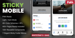
Best Selling! – Sticky Mobile is the leader in Mobile Templates & PWAs across all ThemeForest – Get the best of the best!
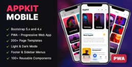
The Rising Star – AppKit Mobile revolutionises the way you build your App, PWA or Mobile Website. Modern, Feature-Filled & Creative!
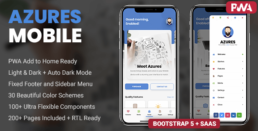
The most creative template in our collection ca become your new App, PWA or Mobile Website. Stand out of the crowd with Azures Mobile!
Conclusion:
Choosing the perfect mobile website template is a critical step in creating a successful online presence. By considering factors such as responsiveness, user experience, speed, customization options, and scalability, you can select a template that meets your needs and helps you achieve your goals. With the right template in place, you can deliver an exceptional mobile experience to your users and stay ahead in today’s mobile-driven world.