In the past 9 years since we’ve been building and selling mobile items we always did our utmost best. We wanted to give you a preview experience that could compare to the real device. In addition, now, if you browse any of our items in our ThemeForest Portfolio, clicking live preview on any item from your device will redirect you directly to the mobile version, not the preview frame. There are a lot of more awesome stuff, and we’ll go through each.
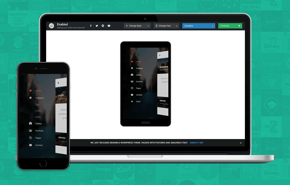
What is an item preview?
The purpose of the item preview is simple. It’s to give you the fastest, easy to use experience when checking our mobile Site Templates and WordPress Themes. Moreover, all in an environment that is focuses solely on the item itself. A lot of authors fancy using frames that don’t even match the realistic sizes of the screens. ( i.e get some second hand mock-up from Google that looks like a phone, then use wrong resolutions and sell you something that in real life looks differently ). However, we calculated all the previews to match phones from their size category.
The item preview system we devised is also connected to a device detection system. Therefore, if you access the preview from a ThemeForest item from your Mobile Device it’ll direct you to view the full experience of the item. ( meaning, you won’t have to scan a QR code to get to the main item, you can do that too from the Item Preview to view specific versions though ).
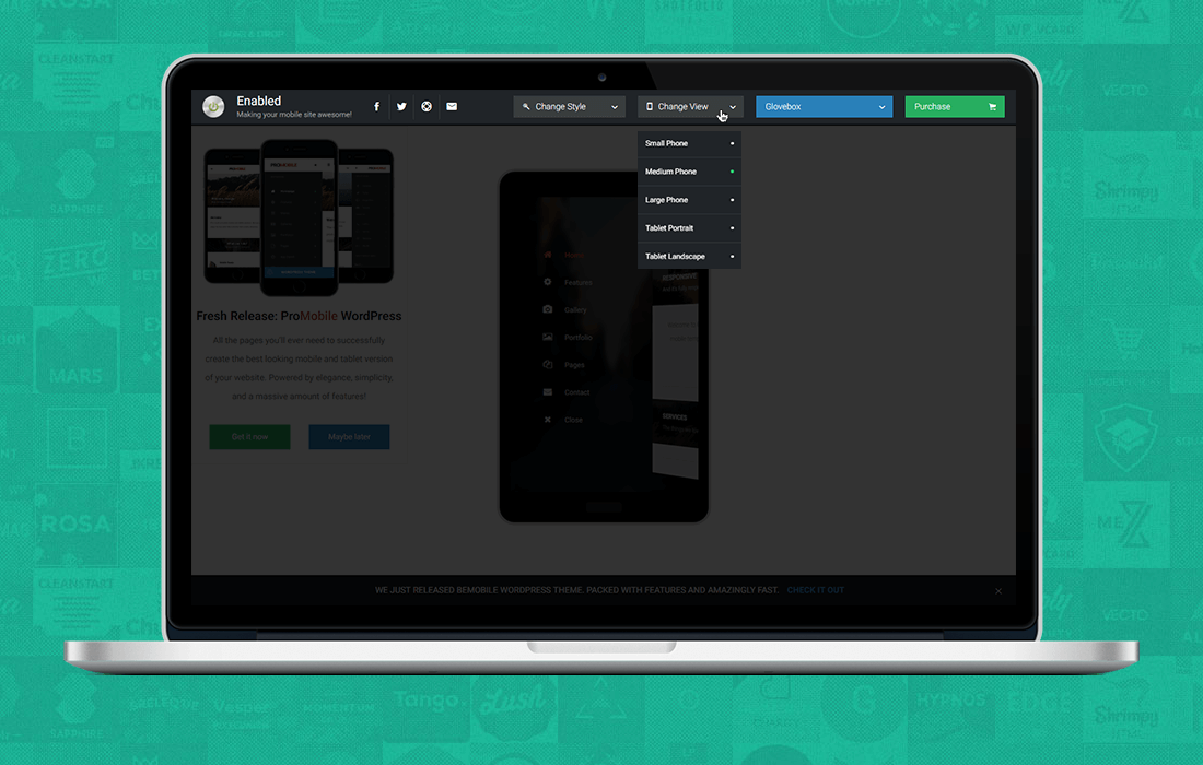
Item Preview Functions
We’ve included the most important browsing tools for you to be able to easily analyze an item prior to purchasing. And these are all tucked away safely in the top right corner so your experience isn’t affected at all. Let’s get into them step by step.
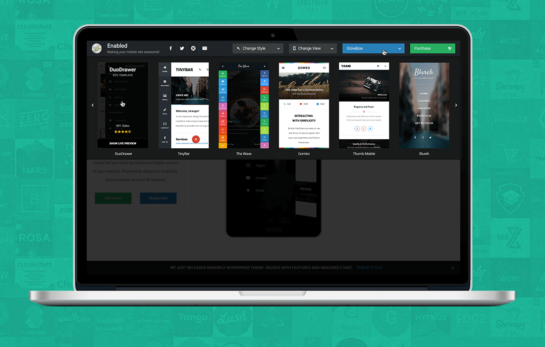
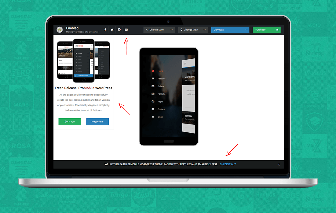
Easily switch between Items.
We’re constantly upgrading, updating and increasing our portfolio with new and more powerful items. Or simply creative and awesome ones. But we came across a big problem when choosing a way for our customers to view all our products. With a portfolio this large, it’s quite hard to showcase 100+ products in one item switcher. And give them all the same exposure. Therefore, we thought long and hard about this. Consequently, we developed a horizontal slider that will present you vertical screenshots of items.
Each item can be hovered and you’ll see the item name, it’s purpose, number of sales and ratings. The best part? It’s a randomising system. Hence, each time you visit the preview, and you select the Choose an Item dropdown menu from the top right side, you’ll always get a fresh new set of items. Last but not least, if you find something you like, just click it in the slider and the frame will automatically load the new item with it’s settings for you.
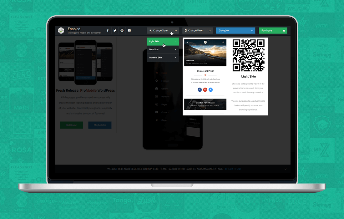
Change an Items Style
Most of our items come with multiple navigation styles or multiple color schemes for the entire item or for the navigation. And of course, tons of different homepages to choose from. Wouldn’t it be easy to to be able to switch between them and see just the one you’re interested on your Desktop Screen or on your Mobile Device without having to browse through all the item? Well, we solved that with great, great ease!
Click the Change Style button at the top left side of the header bar and select the style that you want. You’ll notice that on each style you hover over there will be a secondary box with the name of that style and a QR code. Scanning that QR code will send you directly to that page. It’s fast, easy, and time saving.
We saw that most of our customers are interested in specific pages of our product demos. But don’t want to spend time browsing through the entire item to get to one specific element. So that’s why, we’ve created this awesome feature.
Change Item Size
If you’re like most folks you have access to one Mobile Device or maybe a couple to do your tests on. But what does the item we’re selling look like on other devices? No worries, we though about that as well. We’ve designed a Change Size experience. It will alter the iframe preview size to the view size of your choice. We’ve checked Google Analytics, GSMArena and a tone of other sources to find the exact resolutions for each of these and give you the most possibly accurate experience you could have on that same screen if you’d be holding it in your hands.
The Change Size option also allows you to see what screen sizes the product you’re currently viewing is optimized for. Once you click on a size you like, you’re not redirected to a new frame, you’re not going to lose the current position you’re browsing. The iframe will automatically adjust its width, height and position to match the selected criteria.
Offers, Discounts and New Releases
There wouldn’t be something we’d want you to miss out on. Therefore, we’re constantly discounting items, launching new products, giving promotional content. Moreover, for us it’s very important to make sure that all our visitors and customers get the chance to view them and take advantage of them. That’s why we created the following:
- Offer Box : The offer box will fly in from the left and show you the latest release. This is a random system that will show the latest releases we’ve built together with the best sellers of that period for you to take advantage of.
- Footer Bar: The footer bar is there to give you information on Discounted Products, Freebies and Updates.
- Subscribe & Social Networks: We know you’re busy, and you don’t have time to browse and check our portfolio for new items everyday. You can Follow our Envato Feed or simply subscribe to our Newsletter and you’ll get the latest releases, discounts and freebies directly in your mailbox!
In conclusion, without further adieu, check out our latest preview system by visiting http://preview.enableds.com . Check out some awesome mobile items for your website and don’t forget to subscribe to the latest and greatest releases, freebies, discounts and mobile items!
We absolutely love your blog and find most of your post’s to be precisely what I’m
looking for. Would you offer guest writers to
write content in your case? I wouldn’t mind writing a post
or elaborating on some of the subjects you write regarding
here. Again, awesome blog!
Hello there, we would be indeed interested in having guest posts on our blog. Please send us an e-mail at marketing@enableds.com and we can discuss further details about it! Cheers!
You are so awesome! I don’t suppose I have read through anything
like this before. So wonderful to find another person with some
unique thoughts on this subject matter. Seriously.. many thanks
for starting this up. This site is something that is needed on the web,
someone with a little originality!
Hello and thank you very much, We appreciate your kind words! Cheers!
Howdy! This is my first comment here so I just wanted
to give a quick shout out and say I genuinely enjoy reading through your
blog posts. Can you recommend any other blogs/websites/forums
that cover the same topics? Many thanks!
Thank you for your kind words! Cheers!
I have been surfing online more than 4 hours today, yet I
never found any interesting article like yours. It’s pretty
worth enough for me. In my view, if all website owners and bloggers made good content as you did, the web will be a lot more useful than ever before.
Thank you for your kind words, Rebecca! We are happy you find our blog interesting and useful. Cheers!
You could definitely see your expertise within the article you write.
The sector hopes for even more passionate writers like you who aren’t afraid to say how
they believe. Always follow your heart.
Thank you, Cheers!
Hmm it appears like your website ate my first comment (it was extremely long)
so I guess I’ll just sum it up what I had written and
say, I’m thoroughly enjoying your blog. I as well am an aspiring blog
writer but I’m still new to the whole thing. Do you have any
points for first-time blog writers? I’d definitely appreciate it.
Hello there, we are sorry your first comment did not make it, mistakes happen! We would love to have you as a collaborator to our blog. If you want a quick start, you can write a post for our blog. We’ll evaluate it, give you feed back and if it is a good one it can appear on our website. Make sure you send your article to marketing@enableds.com and we can discuss the details! Cheers!
Hi mates, its fantastic paragraph concerning educationand
fully explained, keep it up all the time.
Thank you, cheers!
When I originally commented I appear to have
clicked on the -Notify me when new comments are added- checkbox and from now
on each time a comment is added I get four emails with the same comment.
Is there an easy method you are able to remove me from that service?
Kudos!
Drop us a message via our contact form (page) and we’ll handle this for you! Cheers! 🙂
We’re a group of volunteers and opening a new scheme in our community.
Your site provided us with valuable information to work on. You’ve done an impressive job and our entire community will be grateful to you.
We’re incredibly humbled and happy to have helped your project guys! Cheers! 🙂