Detect Mobile OS and Change CSS or JavaScript Based on Them
While desktop and laptop web design has changed not by a lot in the past years, mobile web evolved to unrecognisable points, and when it comes to the 2 major platforms out there, running code or adding CSS styles specifically for them has always been a problem for some developers, using resource hungry plugins that only serve to bulk up your site.
Today, we’ll show you how to do detect Mobile Os and change CSS or Javascript based on it, with Vanilla Javascript, and literally no headaches at all. Let’s start.
Step 1: Determining the Variables, detecting Android, iOS and if none exits.
var isMobile = {
    Android: function() {return navigator.userAgent.match(/Android/i);},
    iOS: function() {return navigator.userAgent.match(/iPhone|iPad|iPod/i);},
    any: function() {return (isMobile.Android() || isMobile.iOS()}
};
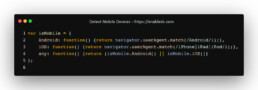
In the above code, we determine the navigator user agents that tell the page which device is Android, which device is iOS and of course, which is both of them in case you wish to serve content for both. Now, let’s line up the functions where we can run the code for each specific platform
Step2: Creating the IF Statements that will house the functions for each Mobile OS.
if (!isMobile.any()) {
    //Trigger only in the case of NO Mobile operating system detected
}
if (isMobile.any()) {
    //Trigger on any Mobile Operating System.
}
if (isMobile.Android()) {
    //Trigger only on Android Devices
}
if (isMobile.iOS()) {
    //Trigger only on iOS Devices
}
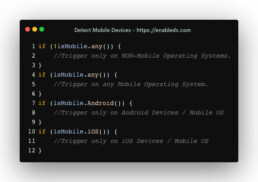
The code above, separate neetly into little if statements will detect if there is no mobile, all mobile operating systems or individual iOS or Android. This is now the base code framework that requires no plugins where you can trigger specific functions for your specific devices.
Step 3: Great use cases for each.
Now, you maybe asking yourself, where this can be used, and there are plenty of places. Say for example you want to run a notifications plugin such as OneSignal, which, as we all know, works only on Android devices. Inside the Android function you can call your script and also, the function to trigger the plugin. Why would you do this? Simple! Why would you load extra , unnecessary plugins, especially ones that don’t work on a different operating system?
We also use this to show different buttons such as “Download this App from the Apple App Store” which would be irrelevant to add on an Android device.
You can also use this to add classes to your Body tag, to easily identify mobiles, where you can load different stylesheet settings for bug fixes on Chrome or Safari mobile which are different on Android or iOS, or to show specific content only for desktops.
We’ve seen a tone of plugins out there, heavy ones, created in a rush, that only serve to slow down pages, where a Vanilla JS solution such as the one we’ve presented is fast, elegant and requires little to no coding knowledge to implement.
Let us know what other code snippets you’d like to see written in a shorter, better, vanilla way and we’ll gladly post a new article for you! As always, you’re free to re-use this code wherever you wish, as long as you don’t use it in paid projects on online code marketplaces.
very usefull article Enabled!
Thank you, mate! Glad to be of service 😀