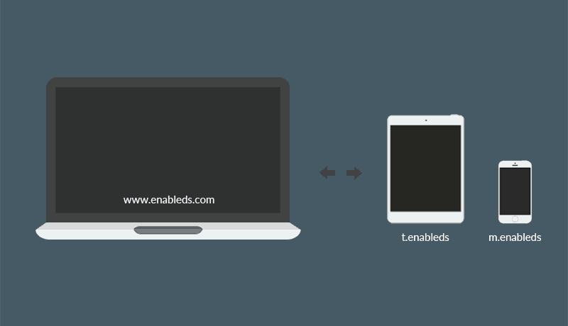
If you opted to make your page beautiful and elegant and use a separate mobile or/and tablet page for your site, then you made the right choice. Your mobile page is beautiful. The experience is better. And most likely, your users find it much more enjoyable than a responsive compressed page. But if you’re like most other customers of ours, you’re facing the problem of how to redirect users to your mobile page. Look no more! We have a freebie for you!
Believe it or not, there are services out there that charge you a monthly fee to redirect your users to your mobile or tablet. Of course, you can argue that you get great feedback on demographics. Moreover, you find out what devices browse your mobile page, how long do they sit on it, and much more. Well, I can assure you that you can do all those things just by simply adding Google Analytics to your site. And yes, you will get all the demographic and device information you need about your mobile page.
Getting back to the subject at hand. Most services that ask you for a monthly subscription to redirect your users from desktops or laptops to mobiles or tablets don’t tell you that they actually use the Google Analytics API in your mobile and tablet page. Furthermore, they just use a simple piece of code for your desktop page to redirect your mobile and tablet users to the specific pages. What the code does is amazingly simple.
The Code
Mobile and tablets leave a signature, called a user agent. When this user agent is detected by the script behind your desktop page, that script acts out and replaces the link at the top of your page with the link to your mobile or tablet page. Pretty simple, right? Let’s see the code!
function mobile_detect(mobile,tablet,mobile_redirect,tablet_redirect) {
 var ismobile = (/iphone|ipod|android|blackberry|opera mini|opera mobi|skyfire|maemo|windows phone|palm|iemobile|symbian|symbianos|fennec/i.test(navigator.userAgent.toLowerCase()));
 var istablet = (/ipad|android 3|sch-i800|playbook|tablet|kindle|gt-p1000|sgh-t849|shw-m180s|a510|a511|a100|dell streak|silk/i.test(navigator.userAgent.toLowerCase()));

 if (ismobile && mobile==true) {
 window.location.href = 'http://www.m.page.com'
 } else if (istablet && tablet==true) {
 window.location.href = 'http://www.t.page.com'
 }
}
We’ll explain how to install this to your page in just a moment. But let’s understand what’s behind the actual code.
On line one we create the function. It will house what a mobile is and what a tablet is. The second line of code defines what mobile devices should the code act on. And you can actually read the code and see the browsers it will fire for. Same applies for line three. However this is specific to tablets. Now, this is where the magic happens.
On line five, if the user agent is detected as being mobile ( meaning, it fits the criteria in line two ) then the window url will be replaced with the address at the end of line six. On line 7, if the user agent is detected as being a tablet ( meaning it fits the criteria in line three ) then the window url will be replaced with the address at the end of line 8. Pretty simple, right?
If you’re asking what happens if a desktop comes along and hits this code, the answer is nothing. Desktop user agents are excluded from the codes in lines two and three. Therefore, this means browsing from a computer will not change anything. The page won’t even feel the extra load time from these humble 10 lines of code!
How to add it to your page
Adding this code to your page is easier than you can imagine. First, copy and paste the code shown above into an empty notepad. Once you’ve done that, replace the addresses for your mobile and tablet page location. Please keep in mind, that m.domain.com and t.domain.com are subdomains and these need to be setup.
Once you’ve copied the code and edited the address, save this file as redirect.js and place it in the root of your desktop site. Edit your desktop’s index.html or index.php file, and import the code right above jquery.js. No problem if you’re not using jQuery. The main idea is that this script needs to be the first thing imported in your page. So it can load instantly and act accordingly. Adding it after all the JS of your page is loaded is just a waste of your bandwidth. Once you’ve done that, you’re all set and voila! Your page now redirects to mobiles and tablets!
This website was… how do you say it? Relevant!! Finally I’ve found something that helped me.
Thank you!
I love what you guys are up too. Such clever work and exposure!
Keep up the superb works guys I’ve incorporated you guys to blogroll.
Thank you very much! We are glad you find our article useful and thank you for sharing it. Cheers!
It’s difficult to find educated people in this particular subject,
however, you sound like you know what you’re talking about!
Thanks
We appreciate it! We’re doing our best to share our knowledge and experience with our users!
Awesome article.
Thank you, cheers!
Thanks for the script! But some questions:
– The call is missing. Adding the function to the header just does nothing, you also need to call it. And mobile_redirected and tablet_redirect are not in use currently. I guess these should be the target urls (which are currently hardcoded in the script)?
– Is it possible to keep the folder path of the original url and use it for forwarding? So if user is on http://www.mydomain.com/folder/index.html I want to forward him to m.mydomain.com/folder/index.html. Would that be possible?
Many thanks!
Send us a message via the Contact Form (link) and we’ll help you out with this. Cheers! ?