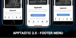
Meet Apptastic 2.0 – A New Footer Menu!
We love our customers and we care about their opinions and needs. Therefore, we have updated our best seller, Apptastic to Apptastic 2.0 and introduced a brand new footer menu!
The menu is extremely elegant, clean and useful! There is no need to have an entire sidebar if you have just a few pages on your website. Therefore, a well built and non-intrusive fixed footer menu can be exactly what you need to create the best user experience for your visitors.
Moreover, the menu changes its colour depending on the skin you have chosen. Let’s say you want the dark skin on your website, hence the menu will be dark. It is exactly the same with the light version too.
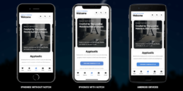
One of the problems you may think of is: what happens with my website if the device has a notch? Well, you really don’t have to worry about that at all. We have implemented notch detection. Therefore, our website can determine if the device has a notch and push the content lower so it looks incredibly great both as a website or a PhoneGap & Cordova App.
        var deviceHasNotch = "false";
        var deviceNotchSize = "44"
We made sure that the user experience and the user interface are at their best quality no matter the device one may use. You can have an iPhone 6 Plus (which doesn’t have a notch), an iPhone X Max or any Android device that has or hasn’t got a notch – your content will be delivered flawlessly! Check out the picture below and see how your content will be displayed on different devices.
Hopefully you will love our brand new update! Moreover, feel free to tell us your suggestions! Oh, before you leave make sure you subscribe here to our newsletter to be the first who gets the latest updates and releases!