
Classic Blue | The Pantone Colour of 2020
Every year there is a general adopted Pantone colour that runs the web. There are many different reasons for this, but the main one is the changing of the style and attitude the webpages adopt as they evolve. This year we have Classic Blue!
But what is a Pantone colour and why should you care about it?
Pantone is the standardised colour matching system which utilises the Pantone numbering system for identifying colours. It is a great system that can help you identify and combine the colours for your project.
Every year, the standard colour changes, adapting it to the needs of the creators and their clients.
In 2019, the Pantone colour was Living Coral. It was all about inducing a “positive and high-spirited feel“. In 2018, the colour was Ultra Violet while Greens were all over 2017!
You should definitely keep up with these trends. This doesn’t mean you should change your entire branding to fit the Pantone colour.
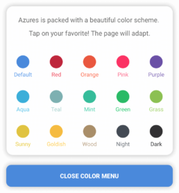
However, changing the highlights in your website is now easier than ever.
We have included in our latest products a great feature. Change the colour with one tap!
Moreover, you can always include the Classic Blue in your articles or promotional pictures used for ads or social media.
What’s such a big deal with the “Classic Blue”?
Despite the colours of the previous years, which induced a specific feeling to the users, the Classic Blue brings professionalism to the table.
People perceive colours as being related to what they can identify in the real world: the green was associated with nature, flourishing, green juices, etc, the Living Coral brought a childish tone along and the purple was electric and futuristic.
When seeing the classic blue colour, people percept it as calmness – much like the ocean. In our case, of web design, the feeling remains the same.
We attribute colours to feelings and other objects around us. For example, when you see a pink or coral themed website, you think about something playful, full of energy.
However, with Classic Blue, professionalism, calmness and seriousness is the key. With the constant evolution of the internet, we see more and more pointless pages. It’s time to differentiate the bad ones from the good and professional ones.
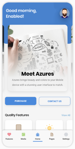
Luckily for you, we have just the mobile templates for you to create the best mobile website or app using the Classic Blue Pantone Colour!
Go Check out Azures | Our Latest Mobile Website Template that is based on Blue! ?
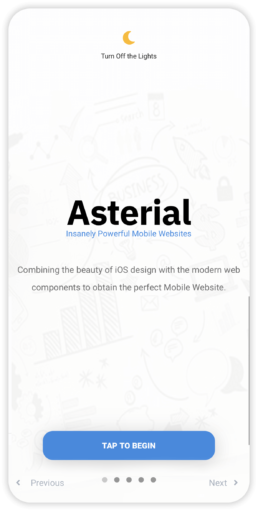
Products Providing the Classic Blue!
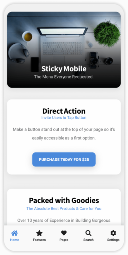
Only These? Absolutely Not, There are More!
These are not all the product that have the Classic Blue! Make sure you check out our portfolio and explore over 100 Mobile Website Templates. Choose your favourite one and tell us in the comments what you think. Do you agree with this year’s colour? What colour would you like to drive the web in 2021? We’re curious!