Mobile Website Menus | Types & Styles
Howdy stranger! In this article we want to share the best ways to implement a menu in your mobile website in order to get the best out the user experience and user interface.
Menus are one of the most important components of any website. Not to mention, in a case of a mobile site, is of utmost importance.
Remember, compared to a desktop version, the biggest disadvantage of a mobile is the limited space for displaying content. This sends us to the next conclusion:
There are two types of menus, each containing its specific aspects.
I. Visible
– Fixed Menu
– Hidden on Scroll Menu
II. Hidden
– SideBar
– Top Menu
– Bottom Menu
– Modal Menu
Now without wasting any more valuable time, let’s dive into each one of them:
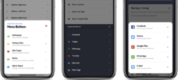
1.Visible | Fixed/Sticky Menu
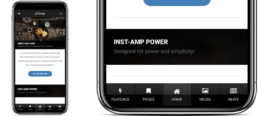
The best example we can provide, beside our example in the picture above which is the menu of AMP Insta is the Facebook and Instagram Bottom, sticky menu.
This type of menu must be very tiny and one of the biggest disadvantage of it is that it does not allow you to have many pages inserted. Therefore if you have a load of content, on many pages, you might be forced to choose maximum five for your sticky bottom menu.
However if you have a small, presentation website it can be the best option! Moreover, facebook and Instagram found another way. They have also opt for a sidebar containing additional pages.
If you want to have or create a sticky / fixed menu, make sure you opt for maximum 5 icons (pages) and don’t make it very tall. Being fixed, it means that no matter what you do, you cannot hide it. Therefore, it will always “eat” some valuable pixels on your mobile visible content.
2. Visible | Hidden on Scroll Menu
This type of menu can be favourable. If you have an iPhone and you use Safari, there exists such menu system. When you open Safari it shows a bar at the bottom of the page. It is called a navigation bar. However, if you start scrolling down, it retracts so the user can enjoy more of the phone’s screen.
The style can be exactly the same as in the fixed menu. Maximum 5 icons and small. The system is different. The biggest advantage of having such system shows on smaller screen phones. Now, on the latest Samsung Galaxy Note 9 (2960×1440 resolution) or on the latest iPhone XS Max (2688×1242 resolution), there is no problem if the fixed menu takes 20 px for example. However, on iPhone 4 or 5 it might be a problem if you also have a 20 px header with your logo.
3. Hidden | Sidebar Menu
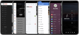
One of our recent article is about sidebars and the advantages they bring. You can check it our here. Therefore, in this article we will create a small resume on sidebars.
They are good looking, non-intrusive and can create a great user experience if the animations are used correctly! Sidebars are one of the most loved type of menu/navigation for Bothe developers and customers/users.
The products displayed are: ProMobile, UltraMobile, AMP Stories, Kolor, AMP Photo.
4. Hidden | Top Menu
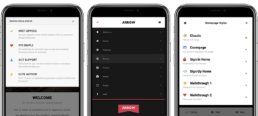
It is of utmost importance to mention that all these menus (in the hidden category) are activated by touching a button. The only difference between them are the place they are displayed.
One of these places can be on the top of the page. This is not often used because of the huge screens that exists nowadays. They are not easy to reach with one hand. If you force the visitor/ user to use two hands when surfing your website, it can badly affect the user experience.
Therefore, consider using it for actions that are not taken often on your website. We always include this option in our products, just in case! However, there are some better options that can help the large screen users.
The products displayed are: Appeca, AMP Arrow, Bars.
5. Hidden | Bottom Menu
The bottom menu is often used because its ergonomic advantage. After you activate the menu there is no much space to reach the wanted page/button in the menu. Even in the sidebar, you need some energy to get to the first component in the menu.
Therefore, if you have some important pages you want to display and you want he users to get fast to them. However at the same time you offer a great user experiencing by not “eating” the space on the screen.
6 Hidden | Modal Menu
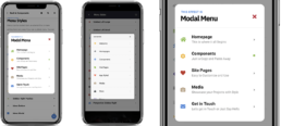
A modal menu is one of the “unusual” menus out there. It gives an incredible impact on the user visual experience! It is that menu that pops out in the middle of the page, having squared or rounded corners and looks absolutely lovely!
This system is also used for notifications, warning pop-ups, ads and many more components that are meant to catch and keep the attention of the user!
All of these are a matter of taste, however don’t underestimate the importance of each individual menus’ functionality. Think what exactly you want to offer through your website and act accordingly! Think about your customer and combine the user interface with the user experience for a complete mobile solution!