5 Tips to Have An Outstanding Mobile Website
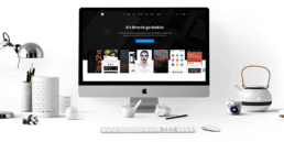
Everybody knows that having a mobile website can be tricky. And this is why the majority of people opt for the responsive WordPress instead. There is no need to pay attention at some detail, you just make the desktop version and it will resize.
But it’s not right! And most of the time it looks awful. As well as you cannot compress a computer to the size of the phone and expect it to look the same, you cannot shrink a desktop version of your website to the size of a mobile website.
We’ve got you covered. Don’t compromise because you compromise your users’ experiences and that is a total no no for your business. Instead, follow the next 5 steps and be amazed of the results!
1. Space
Just think a little bit about you being in a small wardrobe. You don’t need to be claustrophobic to feel like running out of air. Do you like it? No, and neither do words and sentences like being too close to each other. Don’t be afraid to press the enter button for a new row.
Paragraphs are awesome and it makes the user experience a bliss. Many people don’t read each and every word of an article. They read selectively. And there is no problem in that, but you need to help them because they are so many!
Moreover, it is boring to read continuously. When you read a book is something else, so do not expect people to have the same attitude towards your website. You need to capture their attention and keep them with you until the end! So hit that enter button!
2. Overcrowding

The mobile website should be your valet. It should greet your people into your business, give them a taste of the best coffee and invite them to take a sit until you come around. In another terms, your mobile website is just an invitation page to your desktop version!
Don’t insert all your data in it. It will overcrowd it! And that is another no no. Make a resume of the most important things you have to offer, and make sure you do not write too much text. The main idea is enough to capture your users’ interests and make them curious about what you have to offer. Remember, if you present them with an article (which is a lot of text) make sure you used paragraphs and a text size of minimum 12 and never too big.
3. Images & Gifs
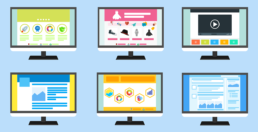
Use images but not too many because your website will load slower if they are not optimised correctly. Everybody loves pictures, they are eye candy and they let you express your ideas in a visual manner which for the most people are a must to keep themselves focused.
You can use normal pictures and gift, animations, graphics, infographics, icons and whatever crosses your mind that give your page a splash of colour. Make sure they are also related to your content. Don’t just put a nice picture of a cat when you talk about astrophysics. We know cats are cute and fluffy, but misleading readers will bring you a very high bounce rate and a lot of upset people.
Remember, pictures are there to help you share the information in a better way. Einstein had a great saying: “If you cannot draw what you are trying to explain, then you did not understand completely what you are talking about!”
4. Navigation
Having a clear and well set navigation menu is of utmost importance for the user experience. You want your website to be intuitive and for your users to not get lost! If they get lost, they will not try to find what they are looking for anymore. At least not in your website.
Therefore, in order to keep them on your mobile website, you need to have a clear menu. Make sure you insert there the essentials: the homepage, about us page, contact page and whatever other page that is specific to the services you offer. You can have one main menu and some submenus, but please do not put sub sub menus to your submenus! This is how your users get lost!
Simple is always better, and in the era of modern design, simple is definitely more beautiful and clean. Having a confusing navigation can wipe away all the cool stuff you have on your website. Be careful of how you present your services, marketing can be a tricky business.
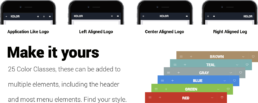
5. Templates

Do you find everything we talked about complicated? It might be if you do not any type of coding experience. But you are covered. Sometimes we need to stick to what we know and let other people to their artwork. This is why the best option for your mobile website is a template!
Our mobile templates cover all the aspects mentioned before. Except for the text part, you can write how much text you want but please don’t! Try to stick to our already existing words suggestions so you get the best of our template.
You can choose from a variety of templates such as Mobile Templates, Google AMP Mobile Templates, Mobile WordPress Themes and even PhoneGap & Cordova Apps!
Find your style and remember we are always here to help! Just drop us a message and we’ll guide you in your journey. Make sure you keep in mind the tips we’ve mentioned above and keep creating!